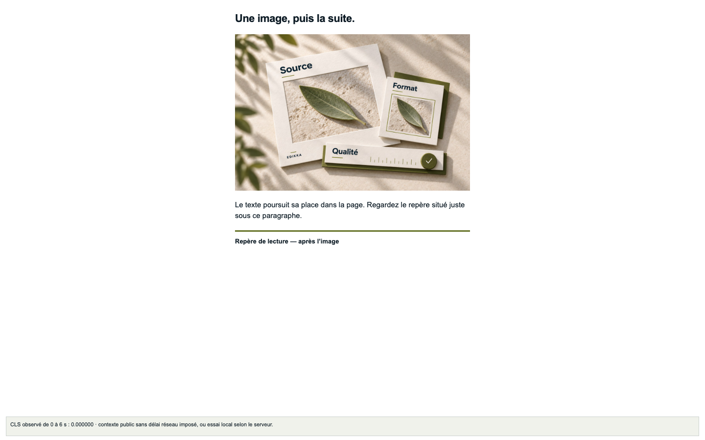
Without reserved space
No HTML dimensions or CSS equivalent
Web image audit grid · IMG22 & IMG23
What happens when an image arrives after the text? Compare the same page with and without space reserved for the image.
01 · Visual exploration
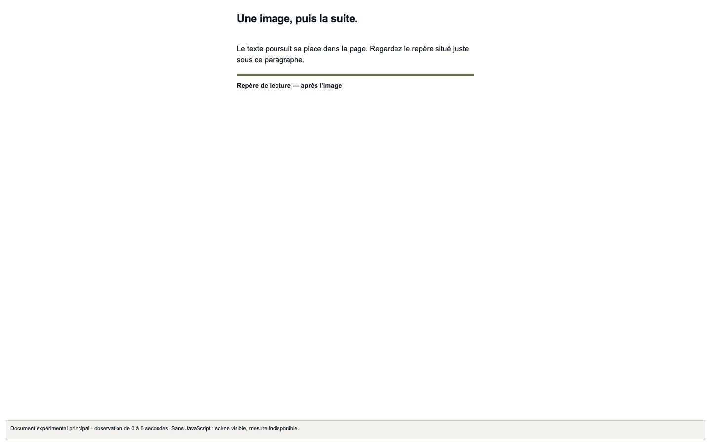
Image appearance delayed for the demonstration: 1.5 seconds.
This is a teaching delay, not measured network latency.
No HTML dimensions or CSS equivalent
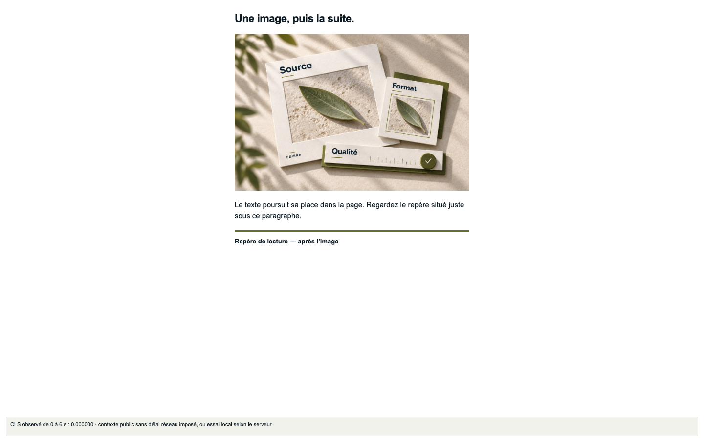
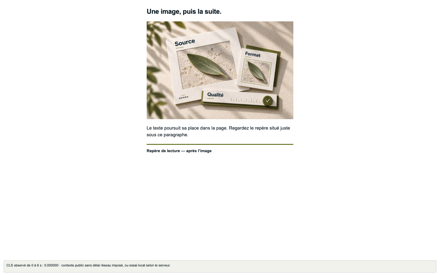
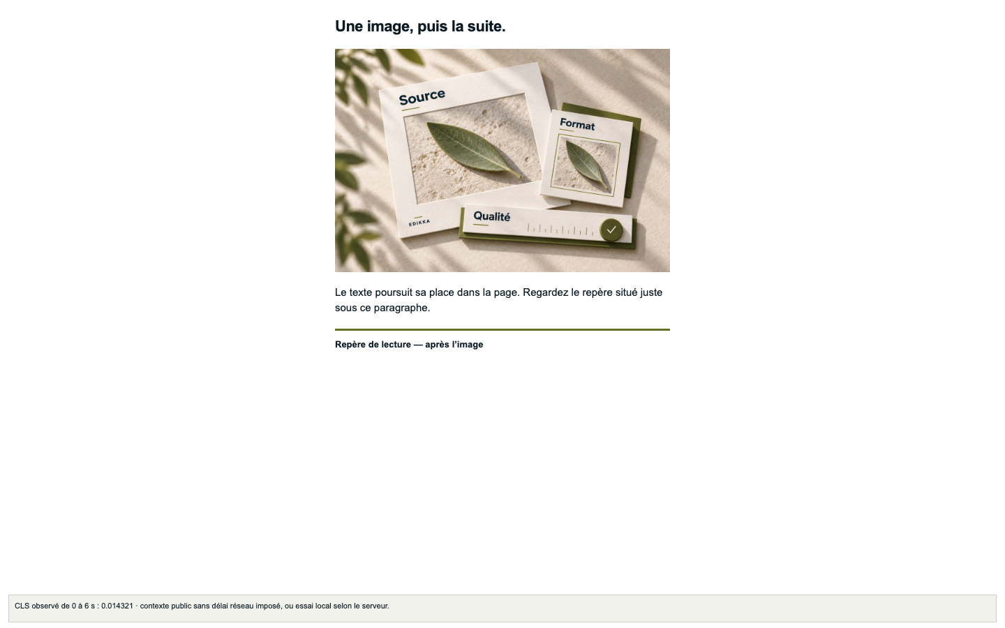
1200 × 800 · the actual image ratio
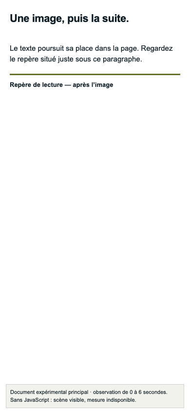
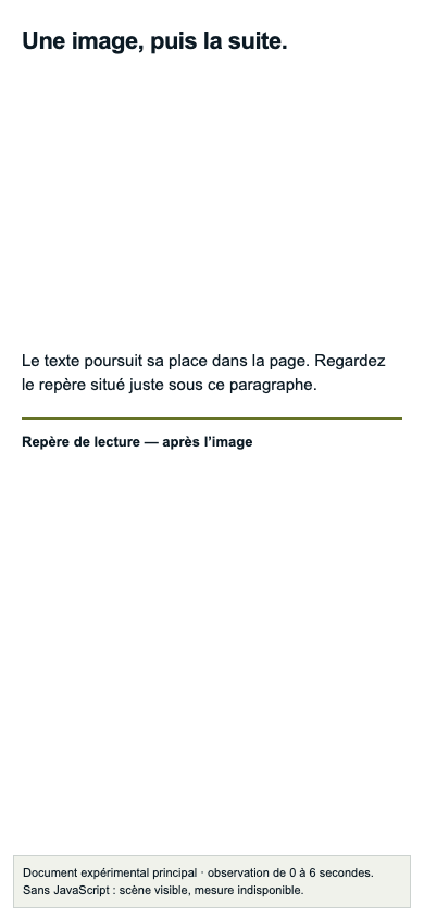
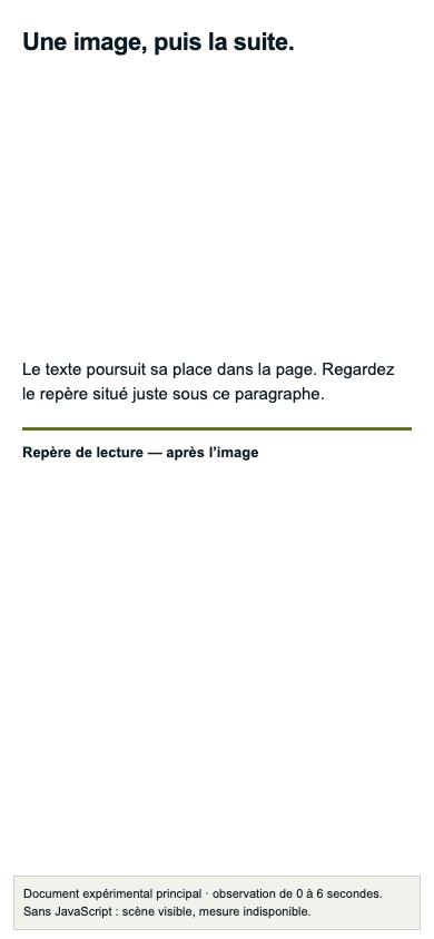
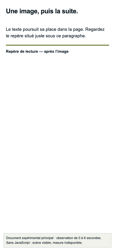
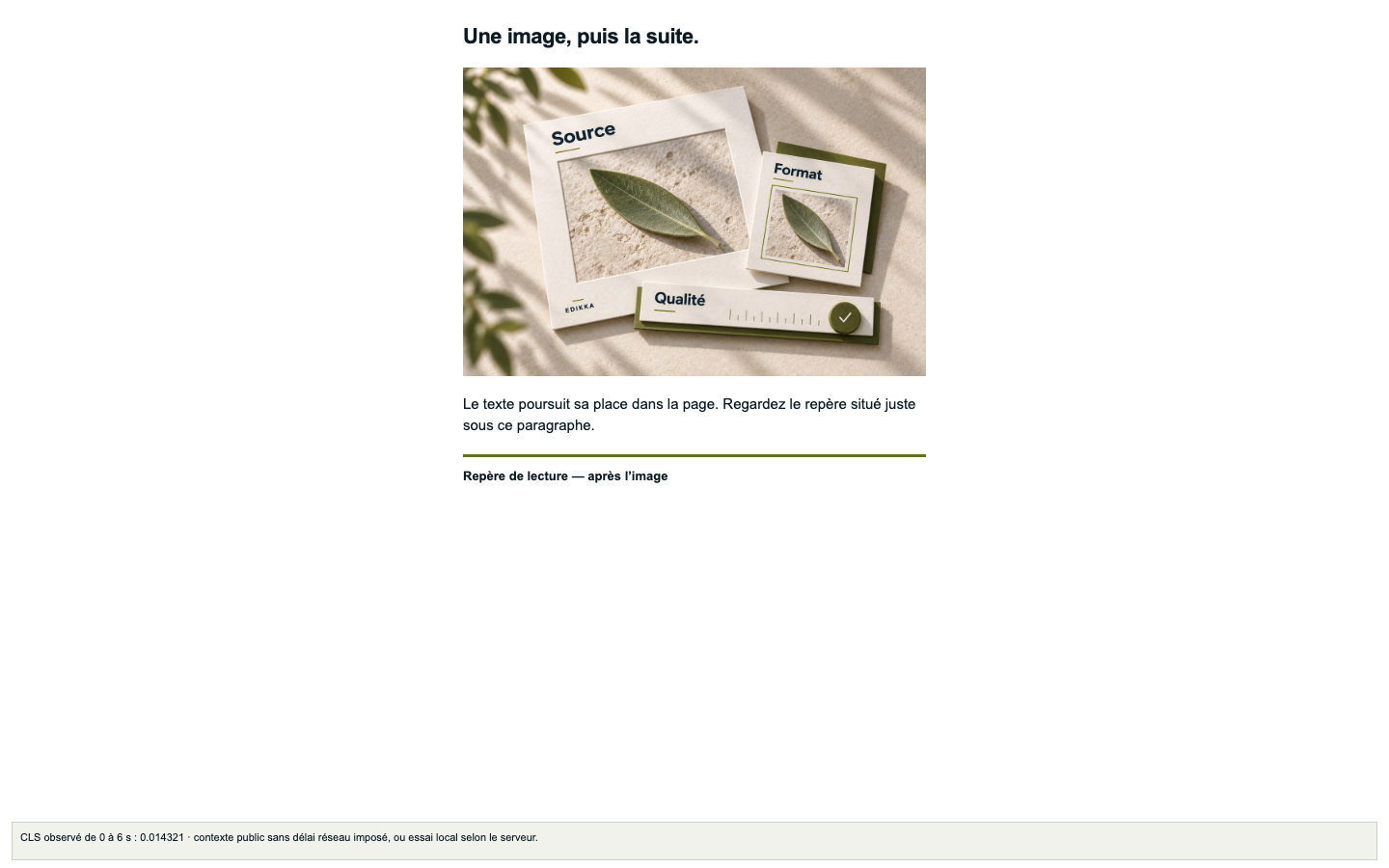
Before: the browser does not yet know the image height. After: the decoded image occupies its space; content below may move.
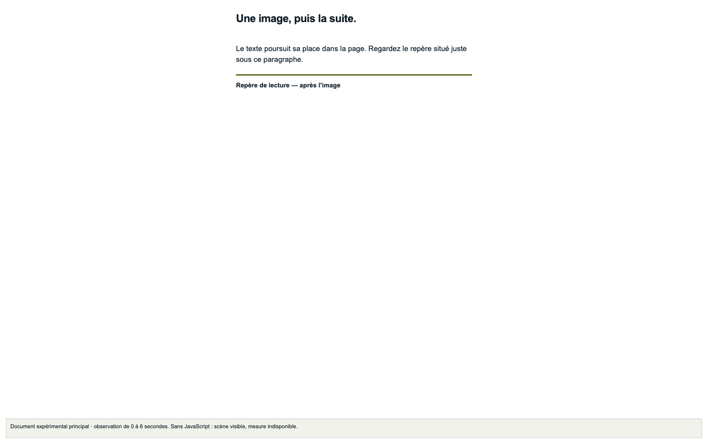
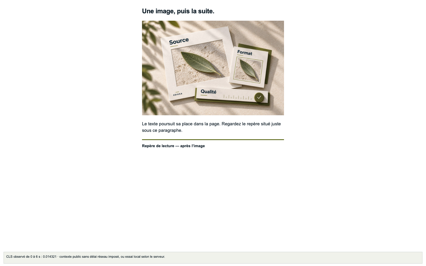
Before: width and height declare a 3:2 ratio. After: the image fills the reserved space. This is the expected mechanism; actual results are recorded below.
02 · The intervention
The image file, text and common CSS are identical in the two experimental documents. The only HTML difference is the addition of width and height. No placeholder, fixed container height or common aspect-ratio reserves space in A.
<img id="image"
  src="../assets/edikka-image.jpg"
  alt="[same alternative text]">
<img id="image"
  src="../assets/edikka-image.jpg"
  width="1200" height="800"
alt="[same alternative text]">Common responsive rule : width: 100%; height: auto; · Full shared CSS. Image: 1200 × 800, JPEG, 152 231 bytes. No image format or compression comparison here.
03 · Archived observations
These measurements come from separate, top-level navigations on a local server. The image is present in the initial HTML; its response is delayed by 2 seconds. CLS is observed during the first 6 seconds. These values do not measure your replay above or a visit to GitHub Pages.
Mobile viewport · A
0.051149Observed CLS · 0–6 s
3 valid trials · 233.33 px CSS
Mobile viewport · B
0Observed CLS · 0–6 s
3 valid trials · 0 px CSS
Desktop · A
0.014321Observed CLS · 0–6 s
3 valid trials · 320 px CSS
Desktop · B
0Observed CLS · 0–6 s
3 valid trials · 0 px CSS
The values above are generated from the archived trials below. Equal repetitions are shown once; different values would be shown as a range. All failures remain in the table.
| Trial / viewport | Variant / repetition | CLS · 0–6 s | Marker · CSS px | Status | Evidence |
|---|---|---|---|---|---|
| 1 · Mobile viewport | A · run 1 | 0.051149 | 233.33 px | Valid | JSON #1 · Before #1 · After #1 |
| 2 · Mobile viewport | B · run 1 | 0 | 0 px | Valid | JSON #2 · Before #2 · After #2 |
| 3 · Mobile viewport | B · run 2 | 0 | 0 px | Valid | JSON #3 · Before #3 · After #3 |
| 4 · Mobile viewport | A · run 2 | 0.051149 | 233.33 px | Valid | JSON #4 · Before #4 · After #4 |
| 5 · Mobile viewport | A · run 3 | 0.051149 | 233.33 px | Valid | JSON #5 · Before #5 · After #5 |
| 6 · Mobile viewport | B · run 3 | 0 | 0 px | Valid | JSON #6 · Before #6 · After #6 |
| 7 · Desktop | A · run 1 | 0.014321 | 320 px | Valid | JSON #7 · Before #7 · After #7 |
| 8 · Desktop | B · run 1 | 0 | 0 px | Valid | JSON #8 · Before #8 · After #8 |
| 9 · Desktop | B · run 2 | 0 | 0 px | Valid | JSON #9 · Before #9 · After #9 |
| 10 · Desktop | A · run 2 | 0.014321 | 320 px | Valid | JSON #10 · Before #10 · After #10 |
| 11 · Desktop | A · run 3 | 0.014321 | 320 px | Valid | JSON #11 · Before #11 · After #11 |
| 12 · Desktop | B · run 3 | 0 | 0 px | Valid | JSON #12 · Before #12 · After #12 |
The experimental scene remains French in all laboratory trials. The two viewports are 390 × 844 and 1440 × 900 CSS px. The marker stays visible before and after loading. These are desktop browser viewports, not tests on real phones.
Measurement dates below are distinct from build or publication dates. Every run records its browser, tools, OS, DPR, cache, image bytes and load timing.
Browser 154.0.8037.59 · Playwright 1.63.0 · web-vitals 6.2.2 · darwin 25.3.0
SHA-256 dd024d945e42b7bd0cadc5321e88104f3d1ea10c3d6eb82cefe1325c51bcf548Twelve trials describe this image, code, browser and protocol. They do not establish a site-wide score, a general statistical effect, an SEO or conversion gain, or accessibility conformance. This version only studies space reservation.
Shift sources identify moved elements, not automatically the cause. Missing API support is reported as unavailable, never as zero. Replay does not reset the parent page’s CLS.
web-vitals 6.2.2 groups unexpected layout shifts into session windows with gaps below 1 second and a total duration below 5 seconds. Entries with hadRecentInput are excluded. We retain the maximum window score within the declared 0–6 second observation. This is not the sum of every shift or the final CLS of an entire visit. Raw entries, timestamps, visibility, errors and moved elements remain available in each JSON.
The protocol was written before collection. The build only generates the static presentation and never runs measurements. A new collection creates a new dated series; existing observations are retained.
npm ci
npm run build
npm start             # public presentation locally
# Separate terminal, fresh laboratory series
npm run measure
npm run results
npm run prepare:publish
IMG22 · Do width and height describe the intrinsic ratio of the candidate or reference fallback?
Compare attributes, decoded dimensions and rendered ratio.
IMG23 · Is space reserved before download at every breakpoint?
Disable cache, throttle the network and inspect the box before decoding.
These controls belong to the existing grid version 1.1. This companion does not add an instrument or claim to validate every breakpoint on a real site.